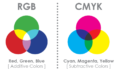
Color mode must be in CMYK to be a print ready file. If file(s) are submitted using any other color mode, such as RGB or Pantone, the file(s) will be converted to CMYK during preflighting for any 4 color process printing. Conversion from one color standard to another may result in a colors shift or colors dropping out. We will keep the Pantone inks for any spot color printing.
A hard copy proof is available in most of our products to view an accurate color representation of your artwork before going to press.

What is CMYK color mode?
CMYK is the color mode used by ColorDigit to reproduce your job on one of our presses. The color calibration of Cyan (C), Magenta (M), Yellow (Y), and Black (K) determines the final color in your artwork. As a result, your submitted files must be in CMYK color mode to maximize color quality.
If your files are submitted using any other color standard, such as RGB or Pantone, they will be converted to CMYK during preflighting. Conversion from one color standard to another may cause colors to shift.
If you are not familliar with printing in CMYK color mode, we highly recomend that you order a hard copy proof, which can be selected for most Color Digit products. Please note that we can not guarantee that the color of your artwork printed on our presses will match that seen on your monitor or printed via any other method.
How can I guarantee color accuracy?
It is impossible to guarantee 100% color accuracy. However, you can maximize color quality by ensuring that all submitted files are in CMYK color mode and that the correct color calibration is set for the desired color match. When these four inks (collectively known as CMYK) are combined, they can produce millions of different colors. Changing the percentage (screen) of one ink can dramatically effect the color. Black (K), the fourth process ink, is often used to darken the colors created by the other three process colors CMY.
When color fidelity is critical, Color Digit recommends that you order a hardcopy color proof. A hardcopy color proof, which can be selected for most Color Digit products, is the only way to ensure the color accuracy for your print job. Our hardcopy proofer is calibrated to our offset presses, however the colors are not 100% match due to differences of two technologies.
How do I match CMYK colors?
It is always challenging to match CMYK colors 100% on paper. Mixing colors on the computer can be challenging, namely when you are trying to translate specific colors to work in a four-color printing process.
Your software program and file type impact the best way to do color matching. Software programs have different tools to do color corrections, and some programs do not have any tools for color corrections. When printing a process (CMYK) document, you should make sure all of your colors are made up of process inks. For example, one hue of green can be made by combining 100% cyan and 100% yellow, and that hue can be changed by reducing the amount of yellow or cyan, or adding small amounts of magenta or black.
When color fidelity is critical, Color Digit recommends that you order a hardcopy color proof. A hardcopy color proof, which can be selected for most Color Digit products, is the only way to ensure the color accuracy for your print job.
When you want an area of solid black within a document, 100% black (K) will not result in a solid, saturated black. You should use rich black, which is made by mixing other colors of ink with black ink to produce a much darker, deeper black on press than can be achieved by using black ink alone. To create rich black on pieces printed by Color Digit, your CMYK calibration values must be 60% Cyan (C), 40% Magenta (M), 40% Yellow (Y), and 100% Black (K).
Color Digit offers both 4/4 (color front, color back) and 4/1 (color front, black and white back).
For 4/1 layouts, the artwork file for the backside should have a CMYK calibration of C:0%, M:0%, Y:0%, and K: 10%-100% depending on the gray you desire. Please note that K:10% is a lighter gray while K:100% is the darkest gray that is not rich black.
Yes. Lighting is important since it will affect how your artwork is perceived in terms of brightness, contrast and color. Ambient lighting, while viewing a digital image file on screen, needs to be considered. A bright room tends to yield darker than expected files, especially when printed. A dark room does the opposite. As a result, we recommend that a room be darker rather than lighter, but also consistent from morning through night.


